Decision models: a clearer view of the trade-offs
Drex v2.0 improves on our broader evidence test, Classify-1 needs a separate input-format comparison, and InsureBench's new charts make the trade-offs easier to see.

The decision-model field keeps growing. This week I added Drex v2.0 and ScaleDown Classify-1 to InsureBench's Decision Models comparison, and gave the charts a clearer visual language.
Two additions, two different stories
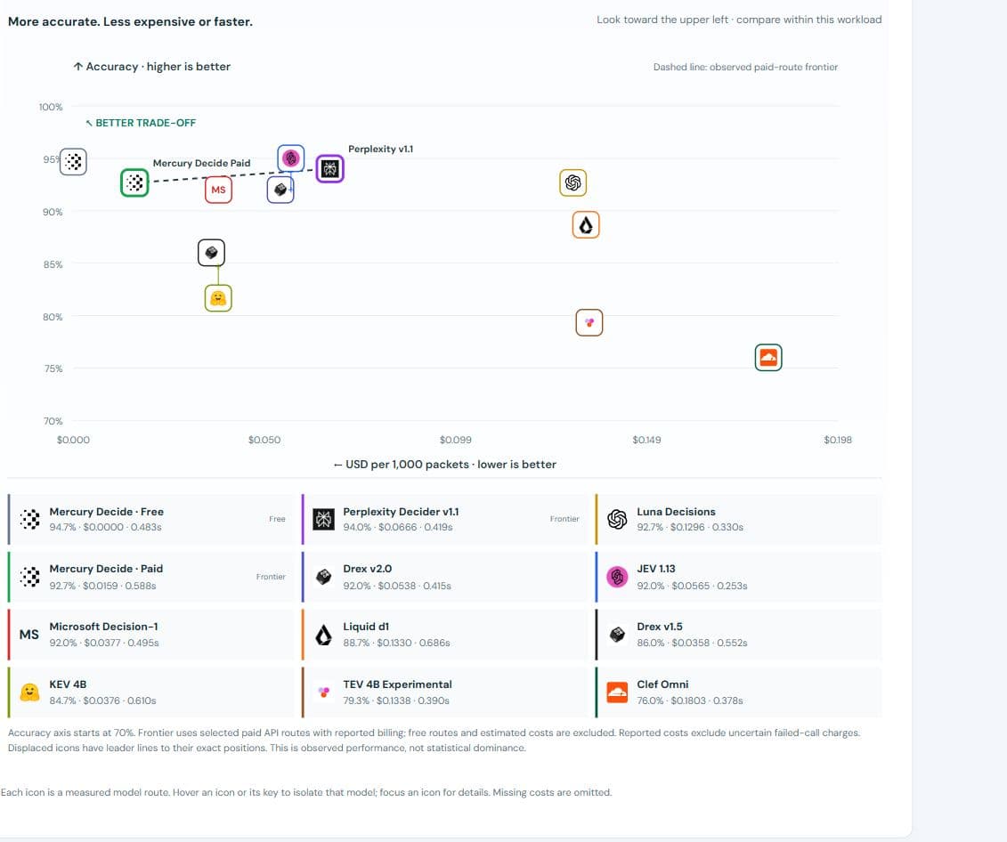
Drex v2.0 scored 138/150 findings (92%), compared with v1.5's 129/150 (86%), on the broader insurance-evidence test. Its measured median completion was 0.415 seconds, versus v1.5's historical 0.552 seconds. The reported cost was $0.0538 per 1,000 four-question packets, compared with $0.0358 for v1.5. Better observed accuracy, faster observed completion, higher cost. These runs were not simultaneous.
There is a practical constraint: the current Drex v2.0 route accepts at most 16 questions per request. The scaling chart therefore shows its measured one- and ten-question results, without extending a curve to sizes it rejected.
Classify-1 scored 101/150 (67.3%), with a 0.671-second median. Its API rejected the structured evidence object used by the other routes. I serialized the complete evidence as JSON text, preserving the questions and answer keys. That result lives in a separate text-state workload, because preserving the evidence does not make the input formats identical.
Classify completed the native 100-question test at 59.5% accuracy, with a 2.90-second median. No image tests were included, even though its catalog advertises image and document inputs.
A chart should make the choice easier
The previous scatter plots were too small and too crowded. The new plots use provider icons, fixed model colors, and a labelled better trade-off corner. A dashed line connects the observed efficient frontier: selected paid API routes for which another plotted paid route does not improve one axis without worsening the other.
Free routes remain visible, but are excluded from that frontier. A promotional zero price would otherwise overwhelm the cost comparison. Estimated costs are also excluded from the reported-cost frontier.
Overlapping icons are separated with leader lines to their exact positions. The keys below the chart show accuracy, price and completion time together. Hovering an icon or its key isolates the model. Accuracy axes state their starting value; unusually wide time ranges use a labelled compressed scale so the fast models remain readable.
This follows a simple principle: spend the visual space on the measured differences, and keep the qualifications close enough to read. A frontier is a useful way to see trade-offs, not proof that a small score gap is statistically meaningful.
The useful choices still depend on the work
Free Mercury retains the highest observed broader-test accuracy at 94.7%. JEV remains the fastest on that comparison. Paid Mercury remains especially inexpensive for shared-evidence batches: $0.000323 per 1,000 questions at a batch size of 100, with 98% observed accuracy on the separate scaling workload.
The broader test uses 50 related packets and author-defined development labels. The scaling questions are correlated too. Neither is an independent, externally adjudicated holdout. Reported costs exclude uncertain failed-call charges; those remain reserved in the run ledgers.
The point is to help choose what to test in your workflow. Open the comparison, select the workload, and look at the trade-off that matters to you.